Signal / The aqua revival, and what we kept
The aqua revival, and what we kept
The early 2000s glassy aesthetic is back on every moodboard. A short note on which parts of it are worth pulling forward, and which parts are just nostalgia in a hoodie.
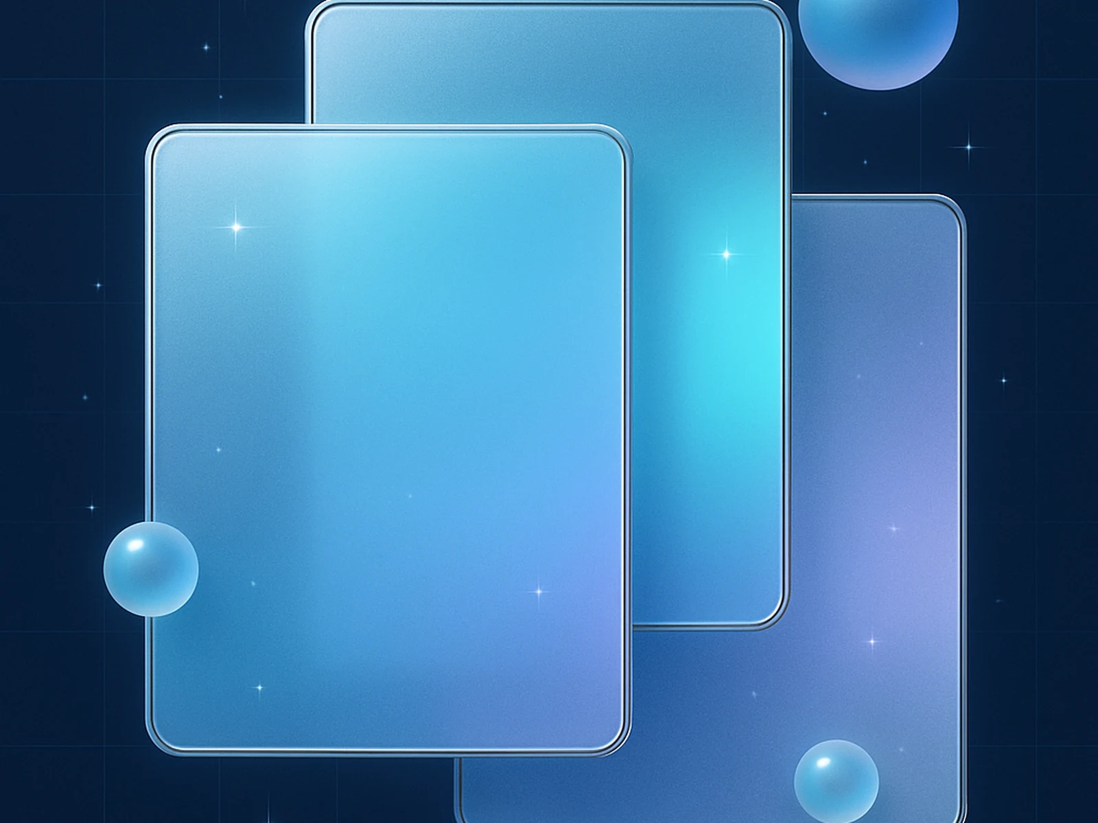
A few months ago we noticed that roughly two out of every five mood boards landing in client briefs included a screenshot of either Windows Vista Aero or early macOS Aqua. We started asking clients what they were responding to in those references and the answers were almost always the same: warmth that does not come from warm colours, depth that does not come from skeumorphic clutter, a sense that an interface had been hand-polished rather than merely produced.
The aqua revival is not a return to gel buttons and pinstriped chrome. The pieces of it worth pulling forward into 2026 design work are the ones that solve real perceptual problems. Frosted-glass surfaces give you readable layering when you need to show context without distraction. Subtle inner light gradients give you depth without committing to a dark mode that limits your colour vocabulary. Generous radii give you the visual softness that helps interfaces feel less aggressive. These choices are still useful; they were not invented to be nostalgic.
The pieces that should stay in 2007 are the ones that were never really design decisions in the first place. Glossy reflections on every surface, drop shadows on every text run, the unrelenting use of skeumorphic textures — those were responses to the technical constraints of the era, not deliberate aesthetic choices. Bringing them forward without that context turns a serious design language into a costume. The studio brief we keep coming back to is: keep the calm depth, drop the gel.
In our own studio work, we use frosted-glass surfaces sparingly for actual context layering — overlays, navigation surfaces, pricing-table side panels. We pair them with generous spacing and quiet typography, which is the part most aqua-inspired designs forget. The early-2000s interfaces felt unstressed not because of the gloss but because they used the gloss against acres of restraint. The minute the restraint goes, the entire aesthetic curdles. So that is the question we ask ourselves on every aqua-inspired brief now: where is the restraint, and is it big enough to carry the depth?